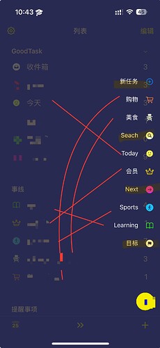
I would like to discuss the "collection" with you.
I think there is a serious logic loophole in "favourites".
① It conflicts with the "display" of "list" on the homepage.
Because if the use of favourites is limited to widgets, then there must be a lot of list-type favourites in favourites. The icon of collection is placed on the homepage of the app, but the homepage is also a list, then there is a weird picture, the homepage is a bunch of lists, and the icon of collection is also a bunch of the same lists.
②The "favourites" icon on the homepage is not free enough.
Based on the first point above, in the case that there are many items in the "list" in "favourites", it would be better if users can hide some of the items, for example: I hide the items such as "target" and "next" in the lower column of the homepage, and choose to display them in the "favourites" icon. I choose to show the items in "favourites" and hide the items in "list" in "favourites" at the same time. Would this be better?
③Should the biggest widget be unlinked to "Collection"?
Through the above two questions, I don't know if you can find out that the root of the problem lies in the setting of "Collection" items, I think "Collection" should be associated with "Search", "Next", "Target", "Report" or more options other than "List", instead of forcing them to be Instead of forcing a "list", the "favourites" widget, which is the biggest widget in goodtask, should be based on a "list". This way it won't force the user to set the "list" again in "favourites".
 Also I would like to have the "slide down" action to be differentiated between the home page and the list, so that I can slide down on the home page to 'search' and on the list to "add task". .
 Is it possible to log in to the official forum in other countries without using a restricted network? Because currently in China you have to use a restricted network to log in.
Hi @shamelessian , thanks for the feedback.
I'm not quite sure what you mean by 'Collection'.
About Favorites, you can think of it as a shortcut to a specific list and view. You can use smart bar or keyboard shortcuts to move directly to your favorites which can be useful while using the app.
I'll keep your feedback about 'slide down' action.
I'm not familiar with restrictions in China. The forum is based on DigitalOcean server and it should be accessible on other countries.
Thanks!
It means "favourites", doesn't it conflict with the home list? What's the point of having the smartbar on the homepage as well, and the favourites on the homepage at the same time? Would very much appreciate a serious look at my suggestion in this one, I'm pretty sure my usage is fine, it's just that there's a logic hole 
Smart button is there to let you access it anywhere. You can turn it off if you don't prefer using it.
I'll keep your feedback. Thanks!
Does it make sense to look at it this way?
Why can't the user be allowed to keep just the part with the yellow background colour? Because the areas connected by the red line are duplicates, they don't make any sense.
Strictly speaking, the only reason why you have the "favourites" item in the red line is because you have forced the largest widget to be a "favourite", and you can only set the widget that way. You should make the largest widget associated with a "list" instead of a "favourite" like all other widgets, and that would solve the problem.
Not sure what you mean by largest widget. Favorites widget is a shortcut to open favorites from the widget. 'Next' widget is from Next page. 'List' and 'Board' widgets can be set via list and view separately.
As you may already know, Smart Button is a quick way to move from different lists wherever you're at. Since you can edit what can be inside, if you don't like lists and views inside favorites, you can remove them as you want.
Thanks!
![]() Also I would like to have the "slide down" action to be differentiated between the home page and the list, so that I can slide down on the home page to 'search' and on the list to "add task". .
Also I would like to have the "slide down" action to be differentiated between the home page and the list, so that I can slide down on the home page to 'search' and on the list to "add task". .![]() Is it possible to log in to the official forum in other countries without using a restricted network? Because currently in China you have to use a restricted network to log in.
Is it possible to log in to the official forum in other countries without using a restricted network? Because currently in China you have to use a restricted network to log in.