First of all, I would like to thank you for you continuous work on GoodTask.
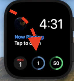
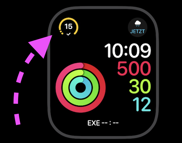
I do have some feedback for the new and improved to Apple Watch complications. It is great to have the number now fully configurable. But I am feeling uneasy about the optical change that the indicators now look like a gauge. They are now similar to the air quality index or air humidity complications from the weather app.
I liked the previous style much better because they indicated progress towards a goal, just like the iconic activity rings.
It may sound silly but for me it’s actually a big deal. This “progress ring” of tasks really managed to motivate to get things done. Now the actual progress is very subtle, since it has been reduced to a small dot.
I understand that the Apple Watch app has been rewritten (it also feels much faster now), and it is probably not trivia to bring the previous drawing logic back, maybe as an alternative.
Still, I would be most grateful if you would consider it.
Many thanks in advance.
Best regards.