Hi, everyone. GoodTask v5.1 has been released. It'll be rolling out soon.
Better Task Detail Page
Task Detail page is now integrated into one page.
All editing (title, notes, subtasks) is done in-line.
Notes field has been brought to the top under title. Under notes, you'll see a row with buttons to change each properties.
Quick Actions has been changed to move horizontally. You can choose between 1~5 lines inside 'Settings - General - Quick Action - Rows'. Quick Actions on bulk action and notification also move horizontally.
You can tap 'Rotate' button on bottom left to move between areas. If you have long list of title, notes, and subtasks, tapping this button will let you move through areas according to the size.
Action button has been added at the bottom. URLs, email addresses and phone numbers on title and notes field will appear. If you have multiple items, 'More' button will appear and you'll be able to choose one.
Option: 'Settings - Advanced - Ignore Phone Number' will remove detection of phone numbers inside task detail page.
Focus button on top right will toggle to show/hide General and Quick Action rows.
'More' button on top right will give you below options.
Share: Single task
Task -> List: Makes a new Reminders list named upon title with notes on 'List Memo' and subtasks as tasks.
Open in Reminders
Delete
On iPad, keyboard shortcut '/' will be used to 'Rotate'. 'TAB' key will rotate through title, notes and add new subtask field. 'CMD + ]' will work as focus button.
New Options
You can now set to show no time tasks at the bottom of timed tasks.
: Settings - Sort - No Time: Last - On
New option of 'Due Date - Relative Date' is added on Task Display. This will show due date as 'N days later' rather than exact date .
: Settings - Appearances - Task Display
Alert settings of 'New Task' has been changed to be more obvious.
: 'Add Alert when Due Date is Set' option - When due date is set, alert will be added according to this option.
: 'Alert Time for No Timed Task' option - When due date has no time, alert will be added with the time set on this setting. If this option is set to 'No Time', when you add a task with due date that has no time, alert will not be added regardless of 'Add Alert when Due Date is Set' option. When due date is already available and it changes to 'No Time', alert will be set to 12:00am.
** I've prepared a simple video explaining the update. Below is link to YouTube channel. I'll upload more videos including tips and tutorials. It'll be great if you subscribe to the channel.
Hi, thanks for the 5.1 update. Something I feel is a step backwards in usability is the single task detail page.
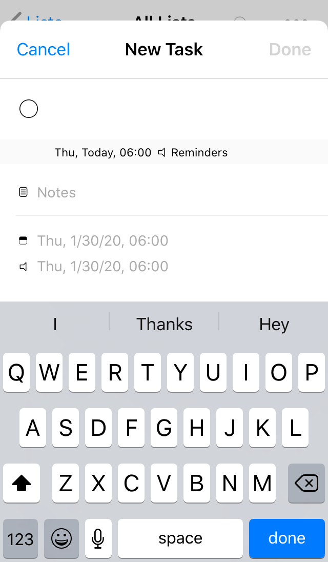
What I loved about 5.0 was being able to very quickly add a task by typing a title, setting a date/time using quick actions the bottom-right "Done" button in the keyboard to finish creating the task.
In 5.1 I type the title, then I need to scroll down past the notes, priority, due dates, alert dates, list etc to get to the quick actions. Scrolling closes the keyboard, so I now have to reach up to the top right "Done" button.
So creating new tasks feels much less efficient in 5.1 than 5.0.
I would like to suggest moving the quick actions immediately below the task title like it was in 5.0.
PS. This is to follow up on my Youtube comment but I thought it would be useful to attach a mockup and also see what others think.
I understand where @patthedog is coming from. While I am still undecided on whether I prefer the v5.0 or v5.1 layout, either way I prefer for the date/time selection option to be above the quick actions, because when I add new tasks I almost always am setting a date/time that does not match up well with my quick actions (would take a lot of quick action taps to get to the date/time and is faster to just pick the specific date/time I want).
EDIT TO ADD:
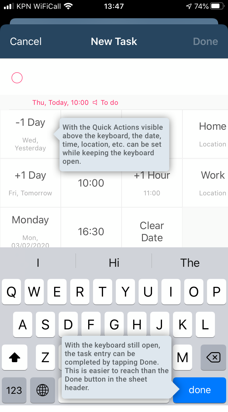
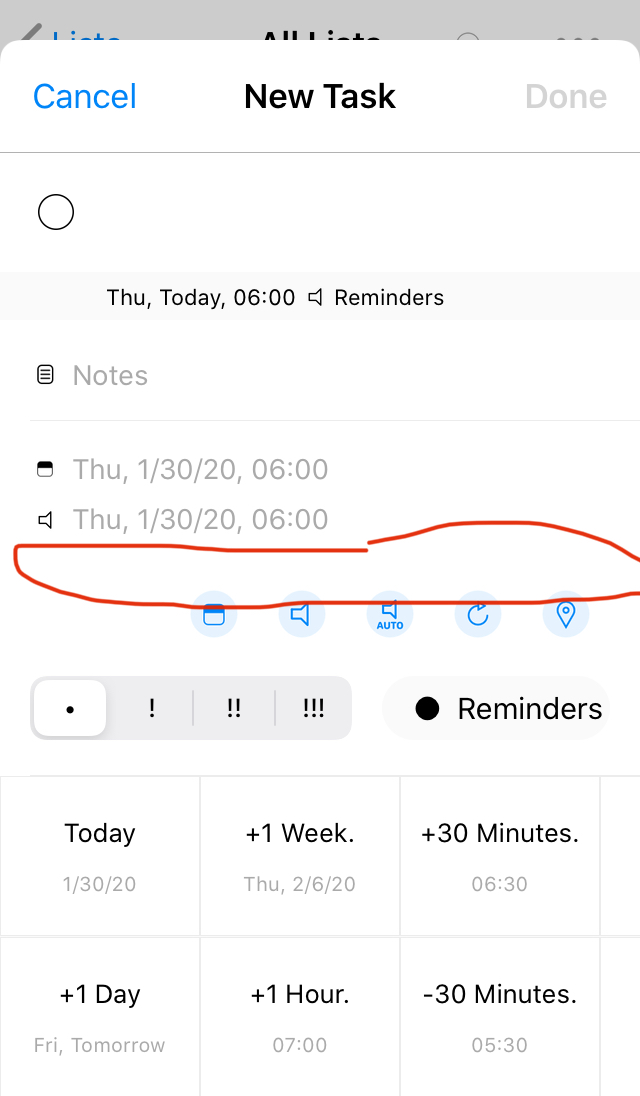
On smaller iPhones, you have to scroll down slightly to be able to see and tap the row of buttons (date, alert, etc.) because they are covered by the keyboard. It would be nice if the white space between the alert date/time and the row of buttons was reduced so that you could see them. See these screenshots:
Interesting. I try to use the iOS date/picker only as a last resort, so if I'm creating a task that's not today or tomorrow, I'll choose a date via a long press on the date/month ticker that brings up the new task entry. 90% of my tasks fall into one of four set times (before leaving home, after my morning coffee, after lunch, before leaving work), but I might not be typical there!
Something that's evident in your screenshots is that the date and time are repeated three times. I don't think I've ever had a situation where I needed separate alert and due dates. But again, maybe my needs are more simple, since I also don't use priorities, auto-snooze, subtasks and very rarely notes.
Great update! The single task detail page is a huge step forward! Fits my workflow perfectly and it also gives a more "modern" look to the app. It's a keeper!
I am really not keen on the recent new update.I use a lot of subtasks so I set the first page when entering a task as the subtask page.Now I would have to scroll down to see the list of sub tasks which isn’t as convenient.I think being able to choose the first page like in v 5.03 and before is much better.Maybe having the sub tasks above the quick actions would help or maybe an option in settings to be able to choose the old style card interface would be an option for people who prefer how they were in v 5.03
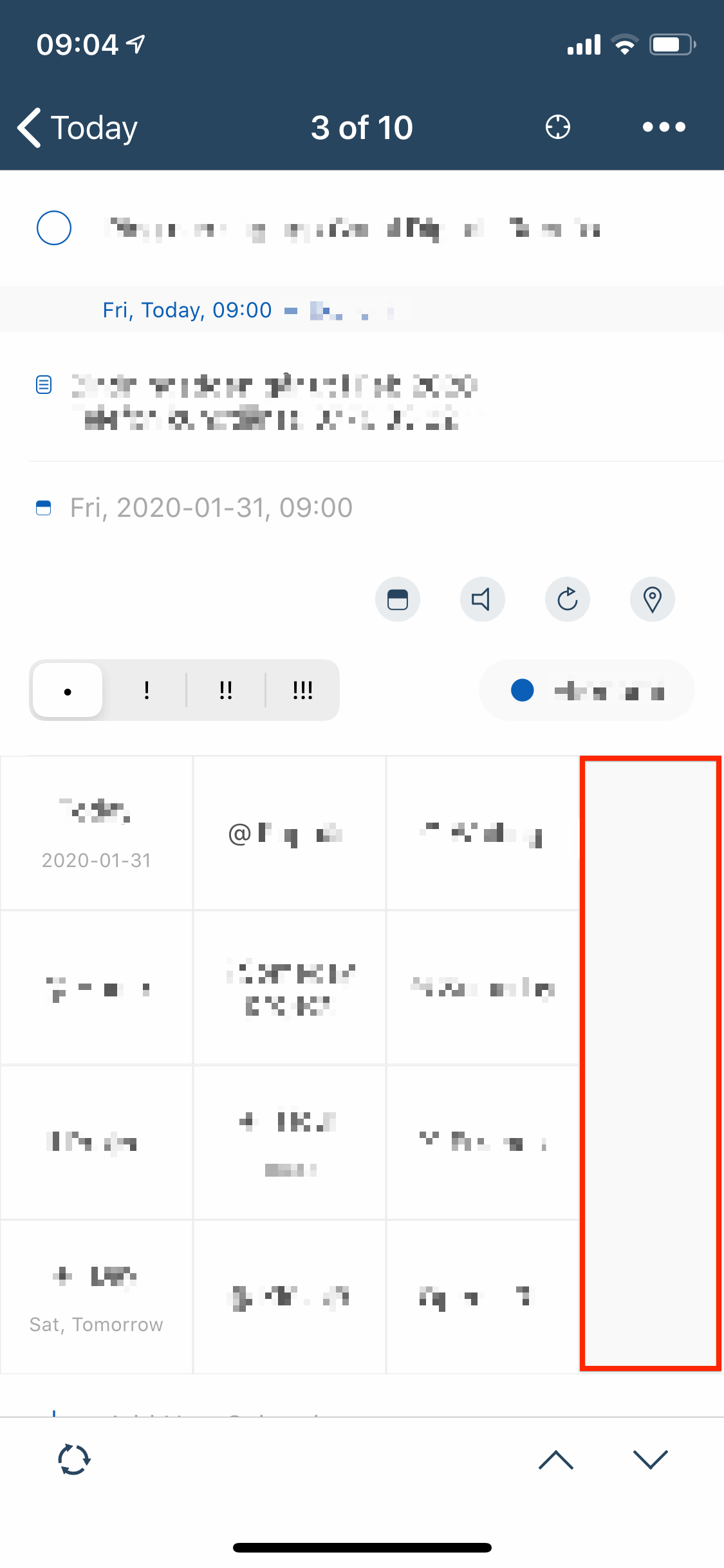
Is it possible to auto-resize the quick action buttons to fill the screen horizontally to remove the empty space to the right if you have just a few quick actions? See screenshot:
Agreed, this update is a step back in my opinion. Lots of unnecessary buttons, weird empty space when you don't usually use subtasks, and the new task detail page is just organized in a random and cluttered way.
The biggest issue I'm having right now is that it seems like bulk actions were removed from the Mac app? I frequently select multiple tasks on my Mac (using command-click or shift-click) and then use the Quick Action buttons in the right panel to change all of the selected tasks at once. Now when I select multiple tasks, the quick actions panel disappears and the entire right panel just says "Multiple Items Selected." Is this an intentional change? Is there some other way to use Quick Actions on multiple tasks in the Mac app?
I like the new update overall, particularly on mac & iPad.
For some tasks with fewer details the new method really shines: you can see everything at once. For tasks with more information, swiping was a faster way to access the different sections but it also could be a bit disorienting.
If I were ordering things in the new detail pane, I'd probably keep the date, priority & list settings right below the title, then quick actions or subtasks (how to choose?) then notes—well, maybe.
It's really a hard call organizing this, and I appreciate your efforts to accommodate different user's needs.
I have to say I really like the new setup, at least I do now that I can use the quick actions with voiceover, I've even been able to get rid of a bunch of quick actions since everything is on the one page.
I found to my surprise that Subtasks first and Quick Actions last seems to suit me best. I'm currently working with:
Subtasks
General
Notes
Quick Actions
That brings actionable items (Task title, subtasks) together for quick completion at the top; keeps task data together when I'm reviewing a task and still keeps Quick Actions handy. On the iPad a vertical "fling", if you will, (swipe up) gets me straight to Quick Actions. On the mac, right-clicking the task or scroll down is fast enough for me.
This is going to sound crazy, but yesterday I changed my quick actions to vertical scroll yesterday and then this morning I wanted to change it and I can't find where the option is anymore. Did it change?