GoodTask v6.4 Release Note

GoodTask v6.4 is rolling out. :slight_smile:

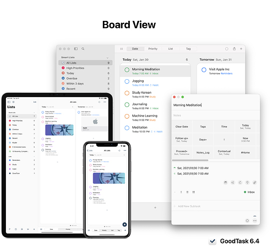
Board View

• Now all the lists can switch between list view and board view. List view includes previous 4 views (List/Day/Week/Month) and Board view includes 4 new views (Date/Priority/List/Tag).

• You can toggle list/board view by tapping button at the bottom left. On iPad, you can use CMD-0 to switch between them.

• Date board view shows 4 boards - Today/Tomorrow/Later/No Due Date. (More days can be set inside settings)
• Priority board view shows 4 boards by priorities.
• List view shows all the Reminders lists.
• Tag view shows all the tags set for the list. Now you can set up tags in 'Sort Options' for all the lists to make boards for tags you want per list.

• If you tap current view at the bottom, it'll move to initial board. You can change settings to make it to move to next board.

• On the left end, List Memo is shown if it exists. You can also quickly move between boards using page control (Dots at the bottom).

• Drag and drop will work like before inside a board. If you drop it in other board, it'll change accordingly to fit into new board. New keyboard shortcuts can be used to move items on iPad easily (CMD-CTRL-Arrow, up and down will also work on list view).

General Default View

You can set up Default view inside 'Settings - General'. This can be used to select certain view on lists that don't have default view set. If it's set to none, list will open with previous view.

Board view settings

: Settings - General - Board View

• Show add button on board. This button will set values of new task to go into the board. On iPhone, if this is turned off, bottom bar add button will work to match the board if 'Contextual List' option is turned on.

• Tap Current View: Tapping current view at the bottom bar will move to initial board or next board

• Show Empty Boards: Each board types can have this option set. It'll show/hide empty boards

• Number of days on Date type, Order on Priority type, place for No Tags board on Tag type can be set

Changes to task selection

Task is now opened modally. On iPad, you can navigate with keyboard arrows and press enter to open. More powerful keyboard shortcuts are set.

On Mac, it'll now open as separate window. You can 'Enter' to open and 'Esc' to close. 'Enter' while it's opened will move focus back to main window.

Appearance

Background color below boards: Group Background Color
Shadow for boards: Pane Border Color

Keyboard Shortcuts on iPad

(Press and hold CMD to get more details)

CMD-0: Toggle List & Board view
CMD-1,2,3,4: Change views. When current view is selected, it'll move to today on Day/Week/Month views and it'll move to initial board on Board views.

Left/Right/Up/Down: Move selection
CMD-Left/Right: Move Boards
Enter: Show item

CMD-CTRL-Left/Right/Up/Down: Move item

(When item is shown)
ESC(CMD-.) & CMD-Enter: Close
CMD-Up/Down: Previous/Next item

CMD-L: Show/Hide Left pane
CMD-OPTION-N: Add new task on currently selected board

Keyboard Shortcuts on Mac

CMD-0: Toggle List & Board view
CMD-1,2,3,4: Change views.

Left/Right/Up/Down: Move selection
CMD-Left/Right: Move Boards
Enter: Show item

CMD-CTRL-Left/Right/Up/Down: Move item

(When item is shown)
ESC & CMD-D: Close
Enter: Move focus to main window

CMD-L: Show/Hide Left pane
CMD-OPTION-N: Add new task on currently selected board

Hope you like the update. Thanks!

app-store app-store-mac

.

2 Likes

Is there a way to make the details window non-modal again? Design-wise it is not a good decision as it now requires an additional mouse click after an action on the modal window: 1st click to focus on the main window, 2nd click to select todo item. Before 6.4 it was not necessary to change the window focus.

4 Likes

Thanks for the feedback. I’ll keep it on the list to consider. You may press enter to open and escape or command-d to close. While task title is on focus, you can press enter again to change back focus to main window.

Also you can move and adjust the window and keep it opened. Thanks!

+1.

I'd appreciate if there was an option to make the details window non-modal! It's not only about the additional clicks/keyboard commands, is also about the visual clutter of a pop-up window.

3 Likes

Wow. Great release. Finally decided to try your App. :slight_smile:

Is there a way to define the default tags for GoodTask in general. I've already figured out to set them per list, but not the general tags.

Hi @Daniel, thanks for using GoodTask. You can set general tags inside 'Settings - Sort - Sort Options - Edit: Tags'. Thanks!

1 Like

I could not agree with previous posters more. Please enable an option to make the details window non-modal again. What use to be right there . . . now requires a double click. I do not like the floating window. This is especially jarring on the Mac, but I would love the previous functionality on the iPad as well.

I love the new "board" option, but it is not worth the sacrifice/change of the UI.

1 Like

Mac user here, and I found that the new changes to the quick actions window are frustrating.

Please change the task details/quick actions window to non-modal OR add an option in the preferences to make this configurable.

The new pop-up window adds to the clutter ; and requires additional double-click action with mouse and breaks my existing workflow.

I also tried using new keyboard actions to open the task detail window; however this doesn't work well with Quick Actions - and the user has to switch back to using mouse. This back and forth switching between mouse and keyboard hampers usability of the great app.

1 Like

Hi there, registered to +1 the not liking the pop open task window on the Mac. Sorry :disappointed:

I am using sub-tasks and it makes extra steps and chasing the mouse all around the screen for marking sub-tasks complete, among other things.

Also if you do keep it, maybe as option, since it is an inspector-type pane I would expect the keyboard shortcut on Mac to be Command+I not Command+D. See iCal, Finder, Music ... pretty much any Mac thing that pops up that kind of window since the beginning of time.

2 Likes

Option to integrate into main window will be added on v6.4.1 coming soon. Thanks!

3 Likes

I also don't like the separate details window, just as all other posters so far. Please revert to previous appearance, or at least make it optional, in case anyone should actually prefer it.

There's also a small bug with it (Mac version): when you're in another app and click on the details window, it does not activate/focus the app, i.e. the menus are still for the previously active app. You have to click in the main GoodTask window to activate it and get to the GoodTask menu bar.

Wow, really great job with the new board layout :clap: :+1:

It opens up a whole new way of interacting with Goodtask and visualizing tasks!!

As I'm starting to explore it more I wanted to ask if there has been any consideration around resizing the board widths? I have a widescreen monitor and would love to be able to increase the width of the boards to see more detail and avoid them being truncated as much.

Thx

1 Like

Thanks for the feedback. The feature is added on Mac version with 6.4.1 update.

You can set it by checking option in menu bar - View - Integrate Panel.

Hi @s.newave, I'll keep it on the list to consider.

Thanks!

1 Like

Wow, that was quick! Thanks

Love the new board view but I think I found a bug. On my Mac when trying to drag a task from No Priority to another higher priority the task snaps back to No Priority. This seems to only happen when there is already a task in the column that your trying to drag the new task into. Eventually the app crashed and I had to restart. I don't see this issue on my iOS devices. Let me know if you need any more information. Thanks

Hi @Johnz, thanks for the feedback. I'll take a look and will fix it soon. Thanks!

1 Like

And I like the new details window on my iPad: ALLWAYS visible is clutter! Maybe a show/hide toggle?

1 Like

v6.4.2 includes new options for theme on iPad.

Also on Mac, you can drag and drop to top title area on board to move board only like iOS rather than put it in specific place.

Thanks!

1 Like

In board view, it would be great to move any empty boards to the end of the list of boards. E.g., priorities with no tasks, tags with no tasks, etc.