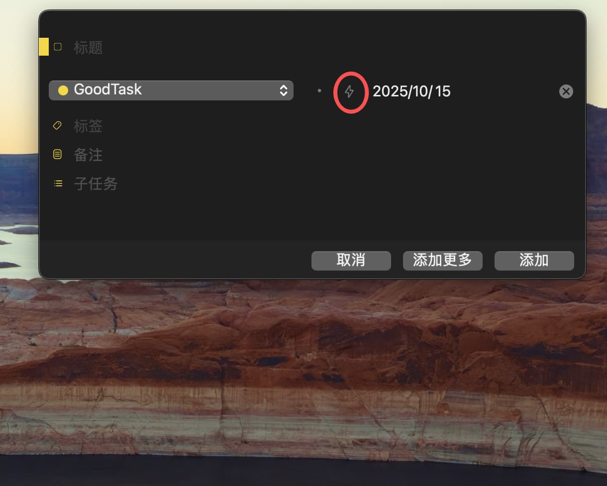
按道理来说,mac 上的操作应该更加便捷才对,但是这里却把“快速操作”缩小为一个 icon 来解决的目的是什么呢?感觉变成移动端那种表格式的方式呈现会更便于用户操作的。
现在mac 反而成为了goodtask 多端中操作最不便捷的一端,有点不太合理。
而且:mac 拥有比移动端更大的操作页面,所以目前这样的处理方式显得更加奇怪了,希望可以变成移动端的表格式。
Logically speaking, the operation on Mac should be more convenient, but what is the purpose of narrowing the "quick operation" to an icon here? I feel that it will be more convenient for users to operate in a table-style presentation on the mobile terminal.
Now Mac has become the least convenient end of goodtask multi-terminal operation, which is a little unreasonable.
Moreover, mac has a larger operation page than the mobile terminal, so this processing method is even more strange at present. I hope it can become a table format for the mobile terminal.