Hello,
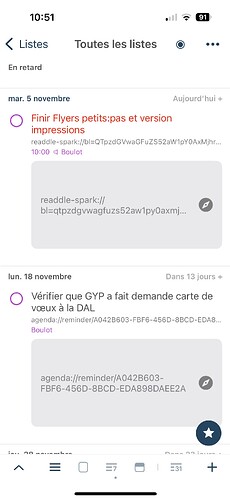
On IOS, the space taken for the backlink to source application is enormous (see screenshot).
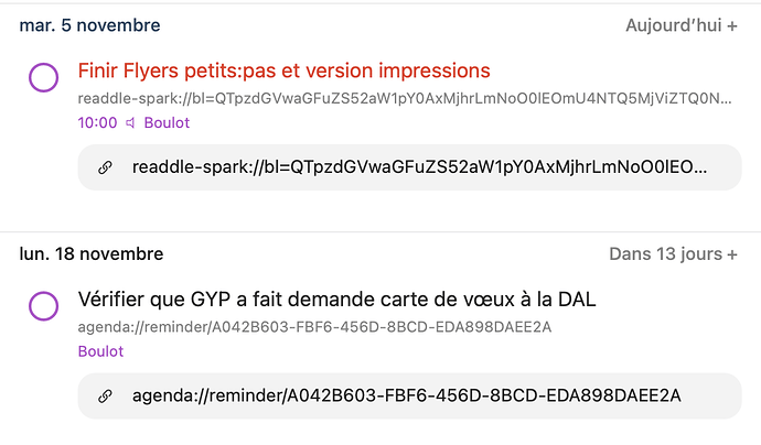
Better on macOS but still necessary to display twice the link: one time below the title and again in a box below.
Maybe I missed something and we can turn this display off ?
I think it would be better to just have a link icon without displaying the URL.
This would allow for a more useable and neat list. Don't you think so ?
Thanks and bravo for this app!
Thanks for the feedback. You can change how links are visible by changing option below.
Settings > Appearance > Task Display > (Default or other options) > Link
You can use smaller icon or turn it off. Thanks!
1 Like
Without the preview, you can’t tell which tasks have links. Can you make a little icon like you do with notes and attachments that indicates a link?
Thanks or the feedback. I'll keep it on the list to consider. Thanks!
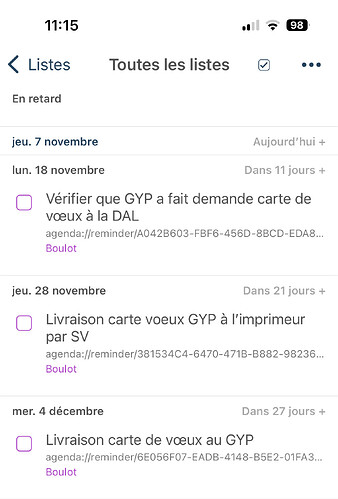
On my devices, even with preview off for links (thanks), they are still displayed below title. So I can see there is a link. But I agree a link icon would be great because these backlinks to application aren't nice at all.
Maybe, GoodTask could display link and preview when it is https:// and hide them when it is app-name://…
1 Like


