Hi. Just want to suggest using icons of 1 / 7 / 30 in the lower bar, instead of the existing dot / circle / square.
I was hoping to get used to those, but find myself feeling lost and needing to remind myself what those buttons do b/c the icons aren't clear and the lower bar can change based on where a user is in the app. Using 1 / 7 / 30 would make recognition quicker & remove that lost feeling.
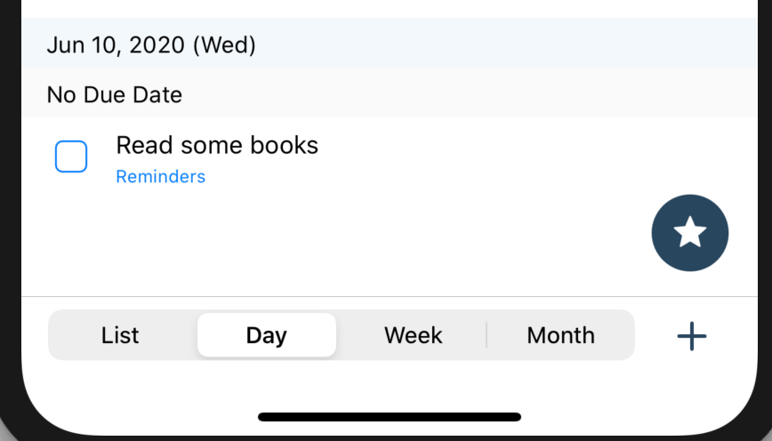
I've tried various options but all of them were not satisfying. I ended up using segmented control like below screenshot. It'll be updated on next v5.6.2.