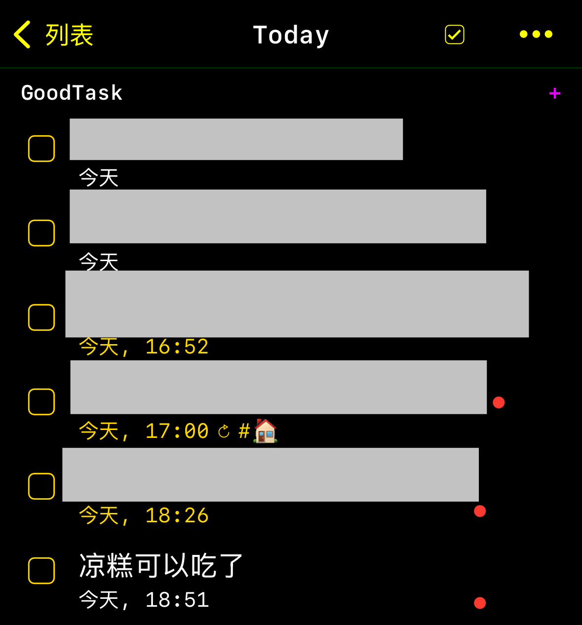
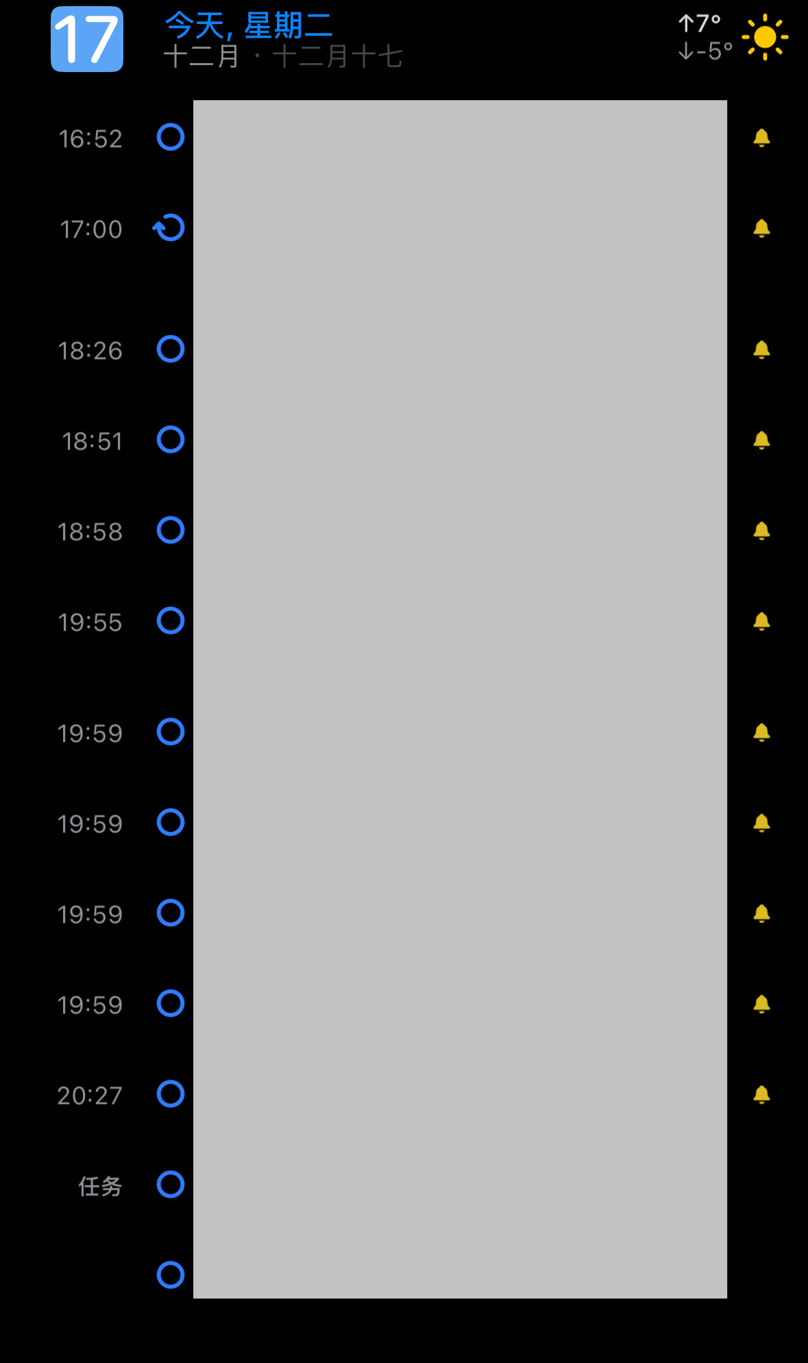
The display of time is too blurry. You can consider this display method on the picture. The current layout not only wastes space (occupying at least two rows) but also blurs the time.
Thanks for the feedback. I’ll keep it on the list to consider.